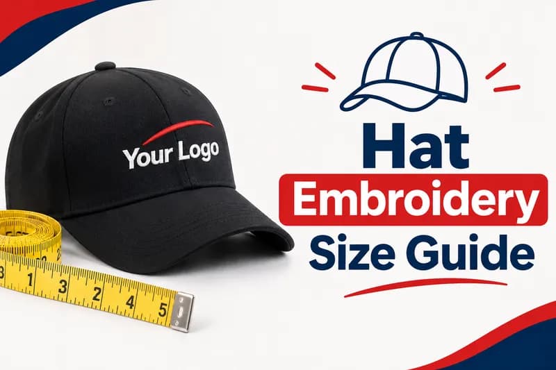
Hat Embroidery Size Guide
Hat Embroidery Size Guide for Logos and Placement
Hat embroidery size sounds like a tiny detail until a logo shows up on a cap looking squashed, crooked or just plain wrong. You’ve probably seen it happen. A design that looked sharp on screen turns into a blob of thread once it lands on that curved front panel. Ever wondered why it goes wrong so often?
Here’s the thing most buyers never hear. Caps aren’t flat. The front panel curves, the center seam pulls on the fabric, and the cap frame holds a hat very differently than it holds a polo shirt. A file that runs fine on a shirt can fall apart on a cap if the size, text height and stitch settings weren’t built for hats. That’s honestly why so many first orders go sideways.
This guide gives you the real numbers. You’ll see the usual dimensions for structured caps, dad hats, trucker hats and bucket hats, the smallest text that still stitches clean, and how 3D puff changes the rules. You’ll also learn where to place a logo on the front, sides and back so it looks intentional.
We’re Digitizing Studio, and we turn logos into machine ready stitch files every day, caps included. So we’ve seen what works and what wastes thread. We’re happy to share it. Keep reading and you’ll know exactly what to send before your next cap order.
Why Hat Embroidery Size Matters
Hat embroidery size decides whether your logo reads clearly or turns into a smudge. Caps have a small, curved stitching area, so even half an inch too tall or too wide can cause puckering, distorted shapes and extra thread breaks. Getting the size right before digitizing saves fabric, time and money.
Think about what a cap really is. It’s a walking billboard for your brand. Don’t underestimate that. People see it from across a room, in photos and on video, and they judge your business in about a second. A crisp, balanced logo says you pay attention to details. A lumpy one says the opposite. And you’ve only got one shot at that first impression.
The market keeps growing too. According to IMARC Group, the global headwear market reached about USD 24.2 billion in 2025 and is projected to climb to USD 37.1 billion by 2034. Other research firms publish different totals, but they all point in the same direction, which is up. More brands are ordering more caps, and that means more files that have to stitch right the first time.
Cap embroidery size is also where most mistakes begin. Customers send artwork sized for a shirt, a website banner or a business card. The digitizer then has to shrink or reshape it, and fine details simply don’t survive. A cap can’t hold a tiny tagline the way a jacket back can. It simply won’t work.
So what should you do? Start with the finished stitched size, not the artwork canvas. Decide how wide and how tall the logo will actually be on the cap, then build the design around that. Nail that single step and your hat logo size questions mostly answer themselves. It’s really that simple.
What Is the Standard Hat Logo Size?
The standard hat logo size for a structured baseball cap is about 4 to 5 inches wide and up to 2.25 inches tall. Dad hats and low profile caps run a little smaller, while some high crown styles stretch toward 2.5 inches in height. Always confirm the limit with your cap style and machine.
There’s a range instead of one number because caps differ. A six panel structured cap has a firm front that holds stitches steady. A five panel low crown cap has a different curve. An unstructured dad hat flexes under the needle. Each one tolerates a slightly different design area. That’s why one number never fits everything.
Here’s what most people miss. The cap logo size that counts is the stitched size, not the size of your image file. A logo that’s 6 inches wide in your design software means nothing until someone decides how wide it will sew on the cap. That decision happens at the digitizing stage.
Our size guidelines page lays out our general limits across garments, and it’s a good place to check before you finalize artwork. If your logo is wide and short, it usually fits a cap well. If it’s tall and narrow, it may need to be reworked.
One more practical tip. Many shops cap the height around 2.25 inches because that’s the zone where the cap frame and the machine hold the fabric most steadily. Push above it and you risk the needle hitting the crown seam or the frame shifting mid run. When in doubt, go a touch smaller and keep the edges clean. You’ll thank yourself later.
Hat Embroidery Size Chart by Cap Style
Different cap styles hold different design areas. The chart below shows the standard hat logo size for each style, using commonly cited ranges, and it’s a solid starting point before you finalize artwork. Exact limits shift with the brand, panel count and machine, so treat these numbers as guides and not guarantees. They’re a starting point, nothing more.
Cap style | Typical front width | Typical front height | Best placement |
Structured cap or snapback | 4 to 5 inches | Up to 2.25 inches | Front center |
Trucker hat | Up to 5 inches | Up to 2 inches | Front center on the foam panel |
Dad hat or unstructured cap | 3.5 to 4 inches | Around 1.75 to 2.25 inches | Front center |
Bucket hat | Up to 4 inches | 1.5 to 2 inches | Front center |
Visor | About 4 inches | About 1 inch | Center of the visor front |
Those figures line up with ranges published by providers such as Printful and Magnetic Hoop. Printful, for example, lists structured caps at 4 to 5 inches wide and up to 2.25 inches tall, and trucker hats at up to 5 inches wide and 2 inches tall.
Notice the pattern. Width gives you room, height doesn’t. That’s because the cap curves up toward the crown, and the machine can only reach so far before the throat plate starts to interfere. So a wide wordmark fits easily inside any hat logo size range, while a tall stacked logo gets squeezed. That’s why you’ll see wide, short logos on so many caps.
If you’re planning a trucker run, the trucker hat logo size is a bit tighter in height because of the foam front and the seam placement. We’ll cover that in its own section. For now, just keep the chart handy and measure your logo against it before you send anything over.
Cap Logo Size on Structured and Unstructured Caps
Cap logo size depends heavily on whether the cap is structured or unstructured. Structured caps have a stiff buckram lining that keeps the front panel upright, so they handle larger, denser designs. Unstructured caps are soft and flexible, so they need smaller, lighter designs that don’t pull the fabric.
Let’s break it down. On a structured cap, the standard hat logo size runs up to that 4 to 5 inch width and about 2.25 inches in height. The stiff front gives the needle something solid to stitch into, which keeps outlines clean and shapes round.
On an unstructured dad hat, things change. The fabric is soft and the front panel moves. A dense, heavy design will pucker and wave because there’s nothing behind it to hold things flat. So you’ll want a smaller footprint, lighter stitch coverage and fewer tiny details. Around 3.5 to 4 inches wide is a safer target. Don’t fight the fabric.
Here’s a quick example. Say a coffee shop wants its round logo on 100 caps. On structured snapbacks, a 2 inch round badge looks great. On soft dad hats, that same badge might need slightly less fill so it doesn’t stiffen the front. Same artwork, different file. That’s normal.
Does that mean you need two separate designs? Not always, but you do need a digitizer who knows the difference. A good cap logo size plan accounts for the cap style first, then the artwork. That’s the exact opposite of how most people order, and it’s why a good embroidery digitizing service asks about the cap before touching your logo.
Cap embroidery size also changes with crown height. High profile caps rise higher, so the front panel is taller, but the curve is steeper. Low profile caps sit closer to the head with a gentler curve. Each one reads your logo a little differently once it’s worn.
Trucker Hat Logo Size and Mesh Back Rules
The trucker hat logo size usually tops out around 5 inches wide and about 2 inches tall on the foam front panel. Trucker hats have a mesh back that can’t hold stitches, so the design has to stay on the front panel and on the stable parts of the cap.
Truckers are trickier because the foam front is thick and the panels meet at a seam in the middle. Stitches that cross the seam can bunch or skip. That’s why many digitizers keep the logo centered and avoid crossing the seam line with fine detail. It’s an easy fix once you know about it.
The foam itself also matters. It’s softer than buckram, so heavy fills can sink in or look uneven. A lighter stitch count often looks cleaner on a trucker. Bold shapes and thick letters do better than thin script or tiny details.
Let’s talk about the mesh. Never plan a design on the mesh back panels. Needles can’t hold a stitch there, and the fabric stretches in every direction. If you want a back logo, think about the strap area or the back of the cap above the closure on styles that allow it.
Here’s the smart play. Keep your trucker design compact and bold. A three word wordmark across the front, or a simple icon with a short tagline underneath, tends to look sharp. Intricate illustrations usually don’t. They’re just too fussy for foam.
One more thing. Some providers publish larger trucker front limits, with a few listing high profile truckers near 6.3 by 2.56 inches. That’s possible on certain styles, but practical results still depend on letter thickness and stitch strategy. If you’re pushing past 5 inches, ask your digitizer before you commit to a large run. Getting the trucker hat logo size right is mostly about restraint.
Hat Logo Placement on the Front, Sides and Back
Hat logo placement works best when the main logo sits at the front center of the cap, with smaller secondary marks on the sides or back. Front center gets the most attention. Side and back marks should stay compact, such as an icon, initials or a short wordmark.
Placement changes your hat logo size too. Here’s what we usually see.
The front center is the hero spot. It gets the largest area, and it’s where people look first. Center the design on the front panel and keep it clear of the seam lines.
The sides are smaller. A side design generally stays around an inch tall, and it works best as a simple icon, a date or a short word. Don’t try to squeeze your full logo there. It won’t read.
The back is a great spot for a website, a slogan or a team name. Many guides suggest roughly 2.5 to 3.5 inches wide and up to about 1 to 1.25 inches tall for back designs. Arching the text so it follows the cap opening usually gives a more polished look.
The visor is limited too. Plan on about 1 inch tall by 4 inches wide, and keep text short and bold. Don’t expect miracles up there.
Ever noticed how the best branded caps feel balanced? That’s usually because the main logo is big, the secondary marks are small, and nothing competes with the front. If every spot carries a full logo, none of them stands out. Less is honestly more.
Hat logo placement also affects cost. More placements mean more files, more stitching time and more handling. For a small brand, one strong front logo plus a small back mark is often the sweet spot.
Minimum Text Height and Line Thickness
The minimum text height for cap embroidery is about 0.25 inches, which is roughly 6.35 millimeters. Some providers accept uppercase letters down to 0.2 inches, but anything smaller risks filling in, thread breaks and unreadable lettering. Thin lines should be at least 0.05 inches thick. Don’t push it.
It’s strict because thread has thickness. That’s just physics. A needle can only place stitches so close together before they merge. When letters are too small, the gaps close up and an “e” starts to look like a blob. Think of writing with a thick marker. You can’t draw tiny, detailed letters with it.
Printful’s design preparation guide lists a minimum text height of 0.25 inches and a minimum line thickness of 0.05 inches for flat embroidery. Other providers say the same thing in different words. The numbers are remarkably consistent across the industry. You won’t find many exceptions.
Here’s a practical test. Print your logo at the exact hat logo size it’ll have on the cap. Hold it at arm’s length. Can you still read the smallest text? If you squint, the embroidery won’t do any better. It’s a simple test, and it works.
Script and serif fonts need extra room. Their thin strokes and tiny flourishes tend to disappear once stitched. If your brand font is delicate, ask for a bolder version for caps, or increase the height so the thin parts stay thick enough to sew.
Also think about contrast and spacing. Letters that sit too close together can touch and blur. A little extra spacing, often called tracking, keeps each letter readable on a curved surface.
Taglines are a different story. Honestly, most of them don’t belong on a cap. A tiny line of text under a logo looks great on a business card but turns into a smear in thread. Cut it, or move it to the back where you have more room. The cap logo size you choose should always leave room for text that’s big enough to read.
3D Puff Hat Embroidery Size Limits
3D puff embroidery needs bigger, bolder shapes than flat embroidery. Letters usually need to be taller, strokes need to be thicker, and fine details don’t work. The foam under the thread is what creates the raised look, so the design has to be simple enough for the foam to cover cleanly.
Here’s the thing about puff. The stitches go over a layer of foam, and the machine perforates and trims it as it goes. Thin lines can’t hold foam in place, so they tear it or leave gaps. That’s why puff needs thick, solid elements. Think chunky, not delicate.
Printful and Magnetic Hoop both point to a detail thickness of roughly 0.2 to 0.5 inches for 3D puff. Go thinner and the foam breaks apart. Go much wider and the foam can flatten, so large areas often need to be split into smaller sections.
In puff, cap embroidery size limits get tighter, and letters also need to be larger. Many shops ask for 0.3 inches or more for puff lettering, and a few ask for more than that. Block letters work best. Script fonts with thin connecting strokes usually don’t survive.
What does this mean for your hat embroidery size plan? It means puff designs often use the larger part of the cap’s design area. A short bold word in puff, say 3 to 4 inches wide, can look incredible. A long sentence in puff won’t. It’ll look crowded and messy.
You can also mix flat and puff on one design. Flat stitching handles the small details, and puff covers the main shapes. That’s a popular choice for crests, shields and monograms. It also gives you more design freedom without risking the foam.
If you want to go deeper, our 3D puff embroidery guide covers materials and results, and our puff digitizing service page explains how we prepare puff files. If you’re comparing costs, the 3D puff embroidery cost post breaks that down too.
How Cap Shape Changes Your Design
A cap’s curved surface changes how a design looks once it’s stitched. Circles can look like ovals, straight lines can bow, and designs near the crown can shift. A good digitizer adjusts the file to counter these effects, so the finished logo looks right when the cap is worn.
Let’s picture it. A cap front isn’t a flat canvas. It bends outward and curves toward the crown. When the machine stitches, the fabric gets pulled in different directions. A perfect circle on screen can turn into an egg shape on the cap. It’s pretty much unavoidable unless the file is built to compensate. That’s what skilled digitizers fix.
That’s where pull compensation comes in. It’s a setting that slightly widens shapes before stitching, because thread pulls the fabric inward as it sews. On caps, the effect is stronger. A skilled digitizer adds the right amount, so edges land where you want them.
Stitch direction matters too. On a cap, stitches are often programmed to run from the center outward. That keeps the design balanced and avoids a lopsided look. It’s a small detail with a big effect on how professional the result looks. You’d notice it immediately if it were wrong.
The crown seam is another factor. As the design gets close to the top of the cap, the machine’s throat plate can touch the inner crown and nudge the frame. That’s one reason height limits exist. Staying under them avoids shifting and misalignment.
That matters for your hat logo size decisions, because the same logo can need different sizes on different caps. A wide logo spreads the curve across more fabric, and a tall logo stacks more distortion. Keeping the shape simple and the height modest makes every cap run easier.
If you’re curious about the mechanics, our guide to best fabric for 3D puff embroidery shows how different materials behave under the needle.
Artwork Prep Before You Order Digitizing
Good cap files start with clean artwork and a clear cap embroidery size. Send a high resolution image or, better yet, a vector file such as AI, EPS, SVG or PDF. State the finished width and height you want on the cap, the cap style, and the colors you need. Clear information means fewer revisions and a cleaner result.
Let’s go through what to send.
Start with the best artwork you have. A sharp PNG or a vector logo works far better than a screenshot or a photo of a printed logo. If all you have is a blurry image, it can still be redrawn, and our vector tracing service handles exactly that.
Next, give the finished hat logo size. Say something like “3.5 inches wide by 1.75 inches tall on a structured cap.” That one line saves a ton of back and forth. Without it, the digitizer has to guess, and guesses cost time. Nobody’s got time for that.
Then mention the cap type. Structured, unstructured, trucker, bucket and visor all behave differently. It’s one of the first things a digitizer needs to know, because it changes density, pull compensation and underlay.
Also list the thread colors you want, or send the brand colors. Most embroidery works best with a limited number of colors, so very detailed gradients may need simplifying. That’s normal. Embroidery isn’t printing. Don’t worry, a good digitizer will tell you what’s possible.
Finally, tell us the format your machine reads. DST is the most common, but PES, EXP, JEF and others are widely used. Picking the right one up front avoids conversion headaches.
Here’s the quick checklist. Clean artwork, finished size, cap style, thread colors and file format. Send those five things and your hat embroidery size question gets answered before the first stitch.
How Your Cap Order Moves Through Our Process
A cap order at Digitizing Studio moves through four steps. First you send artwork and details, then the file gets digitized, then it’s checked, and finally it’s delivered with support for revisions. Each step exists to catch size and stitch problems before they reach your machine.
Here’s how it typically works.
Step one is the order and artwork review. You place your order through your account and upload your logo. You tell us the cap style, the finished size, the hat logo placement and the format you need. The digitizer looks at the artwork to see whether anything needs to be simplified for a cap.
Step two is digitizing. This is where the logo becomes stitches. The digitizer picks stitch types, sets density and underlay, adds pull compensation and plans the stitching order. For caps, that includes center out sewing paths and settings that suit a curved surface.
Step three is the quality check. The file gets reviewed for things that cause trouble in production, like tiny details, excessive jumps and unnecessary trims. If something looks off, it gets fixed before delivery.
Step four is delivery and support. You receive your file in the format you requested. If something needs adjusting, you can reach out and the team will work with you on revisions.
Why does this matter for size? Because each step is a chance to catch a cap logo size problem. A logo that’s too tall gets flagged in step one. Text that’s too small gets caught in step two or three. That beats finding out on 200 finished caps. You’ll save yourself a lot of stress.
To see what the results look like, browse our gallery for examples of finished work. And if you’ve got questions about a specific cap, you can reach the team through our contact page.
Turnaround, Pricing and File Formats
Digitizing Studio offers flat rate pricing and a 24 hour turnaround. Files are delivered in the format your machine uses, such as DST, PES, EXP or JEF. Your exact price depends on the design, so check the pricing page or send your artwork for a clear quote.
Let’s start with speed. Cap orders often come up fast. A brand needs hats for an event, a team needs them for the season. A 24 hour turnaround keeps those deadlines realistic, though very complex designs can take longer, so it helps to order early. You’ll avoid last minute panic.
Now pricing. Flat rate pricing means you know what you’ll pay before you start. You aren’t guessing about extra fees for every small tweak. You can see current rates on our pricing page. For a deeper look at how pricing works for caps in particular, our hat digitizing cost article breaks it down.
Cost comes mostly from the size of the design, how complex it is and how many stitches it needs. That’s one more reason the standard hat logo size matters. A smaller cap logo size with a simpler design usually costs less to digitize and less to sew. A giant, dense one costs more on both ends.
File formats matter just as much. Different machines read different files. Tajima machines often use DST. Brother and Babylock machines usually read PES. Melco commonly uses EXP, and Janome often reads JEF. If you’re not sure what your machine needs, check the manual or ask the manufacturer.
Here’s a tip that saves headaches. Always tell the digitizer your format when you order. Converting later can sometimes cause small changes, and nobody wants surprises on a production run. It’s not worth the risk.
For the broader picture, our embroidery digitizing cost guide covers what drives price across all garment types, not just hats.
Common Hat Logo Size Mistakes to Avoid
The most common hat logo size mistakes are going too tall, using text that’s too small, ignoring the cap style and sending low quality artwork. Each one causes distorted shapes, thread breaks or wasted caps. Catching them before digitizing is far cheaper than fixing them after production.
Let’s walk through the big ones.
Going too tall. A logo that pushes past the safe height can hit the crown seam and shift. Stay near 2.25 inches unless your digitizer says otherwise.
Tiny text. Anything under about 0.25 inches risks filling in. Taglines are the usual culprit.
Ignoring cap style. A cap logo size built for a structured cap can pucker on a soft dad hat. Always tell your digitizer what cap you’re using.
Crossing the trucker seam. Fine detail across the center seam of a foam front can bunch or skip. Keep delicate elements off it.
Low quality artwork. Blurry images force the digitizer to guess, and guesses show up as wobbly edges.
Too many colors. Embroidery works best with a limited palette. Photo style gradients rarely survive.
Copying a shirt design. A left chest logo and a cap front are different spaces. Shrinking a shirt file rarely works, and it’s one of the fastest ways to waste a run.
Ever sent a file and got caps back that looked a bit off? It’s probably one of these. The fix is almost always the same. Plan the design for the cap from the start.
Our post on 3D embroidery mistakes and how to avoid them goes deeper on puff specific errors.
One last point. Many of these mistakes come down to one thing, ignoring hat embroidery size until the end. Treat it as the first decision, not the last, and most problems disappear. You’ll be glad you did.
What to Ask a Cap Digitizing Company
Before hiring a cap digitizing company, ask whether they digitize specifically for caps, what sizes they recommend, which formats they deliver and how they handle revisions. A good provider answers clearly, and they’ll ask about your cap style before quoting.
Here are the questions worth asking.
Do you digitize caps differently from flat garments? The honest answer is yes. A provider who says there’s no difference probably isn’t adjusting for the curve.
What hat logo size limits do you recommend for my cap? You want a real answer with real numbers, not a vague promise that anything works.
Which formats do you deliver? Make sure your machine’s format is on the list.
How are revisions handled? Mistakes and changes happen. You’ll want to know the process before you need it.
Is pricing flat and clear? Hidden extras are a headache on repeat orders.
Can I see examples? Real samples tell you more than any sales page. Our gallery is a good place to start.
How fast can you deliver? For event caps and seasonal drops, timing matters.
It matters because a cheap file that wrecks a run costs more than a good file that costs a little extra. It’s pretty simple math.
A provider who asks about your cap style, your finished cap embroidery size and your machine before quoting is usually one who understands caps. That’s a green flag. If they quote instantly without asking anything, be careful. You’ve got every right to ask questions.
Final Thoughts
Getting hat embroidery size right comes down to a few simple habits. Know your cap style, plan the stitched size and hat logo placement first, keep text above the minimum height, and send clean artwork. Do those things and your caps look sharp, your production runs smooth and your reorders go faster. That’s what good prep buys you.
The numbers are easy to remember. Structured caps usually take about 4 to 5 inches wide and up to 2.25 inches tall. Trucker fronts run slightly tighter in height. Text should stay at about 0.25 inches or taller, and puff needs bolder shapes than flat embroidery.
Digitizing Studio offers embroidery digitizing, applique, 3D puff, chenille and vector tracing, with flat rate pricing and a 24 hour turnaround. Whether you’re a brand ordering your first batch or a shop handling hats every week, clean cap files save you time and thread.
Ready to get started? Place your order with your artwork, finished size and cap style, and we’ll take it from there. If you’re not sure what size suits your cap, reach out through our contact page and ask. No pressure, just helpful answers.
Frequently Asked Questions
What is the best size for a logo on a hat?
The standard hat logo size for most structured baseball caps is about 4 to 5 inches wide and up to 2.25 inches tall. Dad hats and unstructured caps usually work better a little smaller, around 3.5 to 4 inches wide. The right number depends on the cap style, the logo shape and the machine, so check before you finalize artwork. Don’t guess.
It also helps to think about proportion. A wide, short logo usually fits a cap better than a tall, narrow one. If your logo is tall, consider a horizontal version for hats. And remember that the stitched size matters more than the size of your image file, so always give your digitizer the finished hat logo size you want on the cap.
How big can embroidery be on a trucker hat?
Most guides put the trucker hat logo size at up to about 5 inches wide and around 2 inches tall on the foam front. Some high profile styles can allow a little more, but practical results depend on letter thickness and stitch settings. Keep the design on the front panel and avoid the mesh back.
Because the foam front is softer than a structured cap, lighter stitch coverage often looks cleaner. Bold shapes and thick letters usually beat thin script or tiny taglines. If you want to push past 5 inches wide, ask your digitizer first so you don’t discover a problem after the whole run is stitched. It’s a quick question that saves a lot.
What is the smallest text you can embroider on a cap?
The smallest text that stitches clean on a cap is about 0.25 inches tall, or roughly 6.35 millimeters. Some providers accept uppercase letters down to 0.2 inches, but going smaller risks filled in letters and thread breaks. Thin lines should be at least 0.05 inches thick.
Script and serif fonts need more height, because their thin strokes disappear when stitched. A simple test is to print your logo at actual size and hold it at arm’s length. If you can’t read the smallest text, the embroidery won’t be any clearer. When in doubt, drop the tagline or move it to the back of the cap.
Where should a logo go on a hat?
The main logo belongs at the front center of the cap, because that spot gets the most attention and the largest design area. Smaller marks, like an icon or a short word, work well on the sides. The back suits a website, slogan or team name, usually around 2.5 to 3.5 inches wide.
Good hat logo placement keeps one clear hero and a couple of small supporting marks. If every area carries a full logo, nothing stands out. Keep designs centered, stay away from seams where possible, and remember that every extra placement adds stitching time and cost. It’s better to keep it simple.
Does 3D puff change the logo size on a hat?
Yes. 3D puff needs bolder, thicker shapes than flat embroidery, so designs often use more of the available area. Detail thickness is commonly cited at about 0.2 to 0.5 inches, and puff lettering usually needs to be taller than flat lettering. Thin lines and tiny details don’t hold the foam properly. That’s why bold wins.
You can also combine flat and puff in one design. Flat stitching handles fine details while puff covers the main shapes. If you’re planning a puff cap, share your artwork and finished size with your digitizer early, so they can tell you what will work before you commit to a run.
What file format do I need for hat embroidery?
It depends on your machine. DST is the most widely used format, and PES, EXP and JEF are also common. Tajima machines often use DST, Brother machines usually read PES, Melco commonly uses EXP and Janome often uses JEF. Check your machine’s manual if you’re not sure. It’s usually listed there.
Always tell your digitizer the format when you order. That way the file arrives ready to load, with no conversion step that could introduce small changes. At Digitizing Studio, you can request the format your machine reads when you place your order.